Brilliance in design: A nod to the sun at the Embajada de Mexico on Pennsylvania Avenue in DC
Earth Day
April 22, 2017
Smita Chandra Thomas

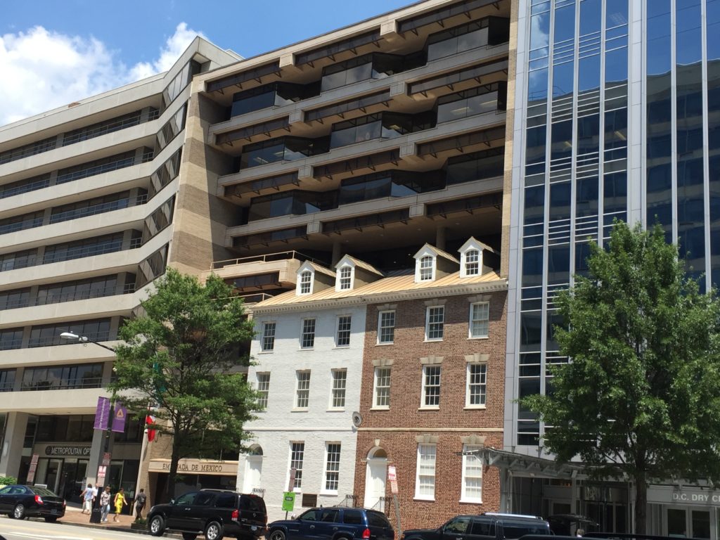
Image 1: Embajada de Mexico, Pennsylvania Ave, Washington D.C. on a July afternoon. Image by the author
Located on Pennsylvania Avenue between 19th and 20th streets in Northwest DC, Embajada de Mexico (Embassy of Mexico) catches the eye for a couple of reasons. First, the juxtaposition of two quaint residential fronts — the likes of which are more often seen in well-preserved historic neighborhoods like Georgetown — bravely jostling with the modern commercial buildings on either side is hard to ignore. But the other, even more striking, feature on a hot July afternoon is the completely shaded façade of the building. The picture above is taken at the height of the afternoon, and the entire facade is in shade. Compare that to the sunlit facades on either side, especially our all-glass friend on the right.
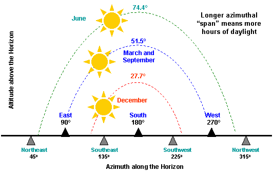
A fair number of well-designed window shades take advantage of the simple fact that the sun is higher in the sky in the summer, and lower in the sky in the winter. As a student of solar patterns would know, ‘the sun always rises in the east’ is only true at the time of equinox, when the day and night are equal in late March and September. For the rest of the year, the sun goes progressively north-east or south-east. This entirely dependable annual pattern lends itself to some ‘cool’ window shade designs that do not block the winter sun but provide shade in the summer, as they should.

Image 2: The image is of the sun path over DC. Depending on the latitude, the exact angle of the sun path will change. But for any given location, it follows the exact pattern year after year. Hence, sundials. Image courtesy Boston University
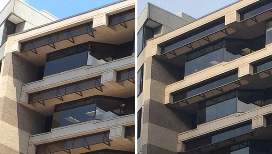
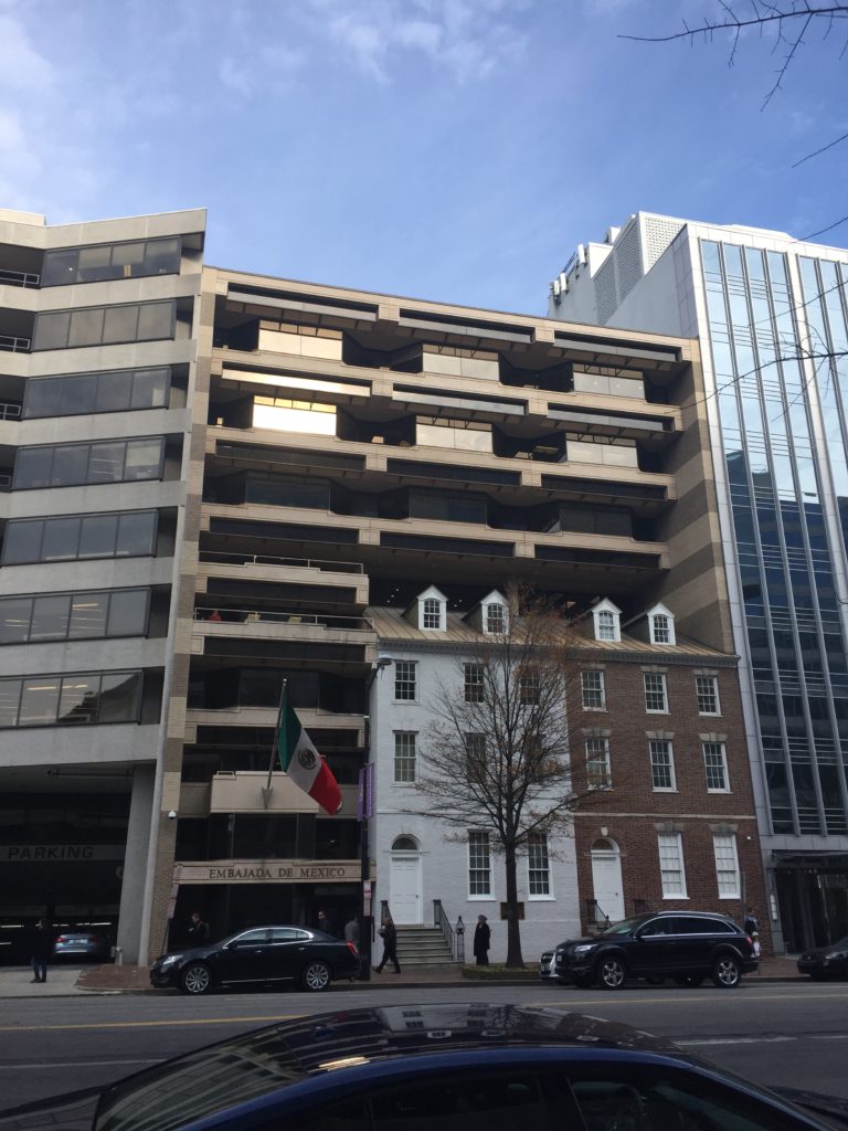
What sets the Embassy apart is the fact that not just the windows but the entire face of the building is in shade. Stare at it a little closer and you realize that each floor overhangs over the floor below, creating a cascade of cantilevers that follow the line of the sun’s shadow and help to keep the entire facade in shade. It’s done so subtly, it’s barely noticeable. Surely, this was no accident of design. A purposeful stroll by it on a winter noon and sure enough, the facade is taking in what it can of the winter sun.

Image 3. The embassy façade in the afternoon (1) in July, and (2) in December. The windows are in shade in July, and exposed to the sun beams in December. Images by author
Such brilliance in design warranted a Google search. To my dismay, I could not find any articles online talking about this passive design feature. The building was built in 1986 before the internet boom, so there may be something in print buried in a library somewhere. My attempts at contacting the architect Peter Vercelli were not successful either, or we may have had the story from the architect himself. According to this 2013 article from ‘TheInTowner’ (link to original article accessed on April 22, 2017) — which is not very kind to the architect’s choice of incorporating the old parts into his building as mere facades — the buildings are historic indeed; two of the original Seven Buildings from the late 1700s that were some of the earliest and most fashionable residences in Washington. And now, these old ladies serve the purpose of drawing attention to the building that might otherwise go unnoticed for its subtle brilliance.
It seems entirely fitting that the design of the Embassy of Mexico, a country that celebrates the sun in so many ways, pays homage to the sun. As we struggle to combat climate change, this building stands as a shining, or rather, well-shaded example of what good passive design looks like.
